Graphs
The most effective way to turn data into a communication tool is by plotting it and graphing it. Graphs are important statistical tools in Six Sigma and Lean Six Sigma. Some of the commonly used graphs are Pareto Chart, Dot Plots, Histogram, Box Plot, Time Series Plot, Control Charts, Scatter Plots. A quick overview is given below.
Types of Inputs and Outputs: Inputs are oftentimes called X’s to the process. Outputs are oftentimes called Y’s. X’s are also known as key process input variables or sometimes called KPIV’s, and outputs are called key process output variables or KPOV’s. There are two types of input variables. The first type of input variable is a categorical input variable like vendor name, part shape, operator qualification, machine type and tool type. The second category of inputs available are called continuous inputs, like temperature, line speeds, quantity produced, production time. Continuous inputs are inputs that are measurable on a quantitative scale.
| Categorical Y | Continuous Y | |
| By itself |
Dot Plots Histograms Box Plots |
|
| Versus time |
Time Series Plot Control Charts |
|
| Versus Categorical X | Pareto Chart |
Multiple Box Plots Multiple Histograms |
| Versus Continuous X | Scatter Plots |
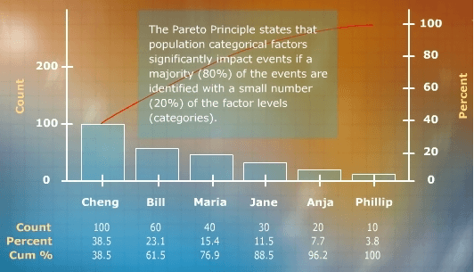
Pareto Chart
Pareto Chart: Pareto diagrams are a great tool to analyze categorical or attribute output data, like defect counts, against some kind of classification that serves as X variable. The first Y-axis is some count, typically a defect count. The second Y-axis shows a cumulative percentage from 0 to 100. The X-axis here serves as a categorical axis. Pareto Principle states that a categorical factor is significant if 20 percent of its levels contribute to approximately 80 percent of the events or defects. Below is a sample of Pareto chart plotted against different operators.
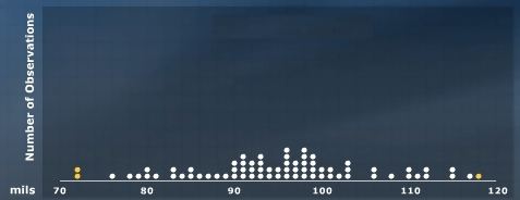
Dot Plots
Dot Plots: In order to construct a dot plot, each observation of the data set is taken and its value plotted on the X axis. The observations are plotted as they are collected. Below is the sample of dot plot constructed with each observation plotted as dots on the chart.
Histograms
Histograms: One of the most popular types of charts utilized to analyze a continuous output variable is called a histogram. The X-axis of a histogram is the performance characteristic that you’re interested in measuring. histogram is nothing more than a less discrete dot plot. Notice in the dot plot each value in the data set has its own column, but in a histogram the groups of values are lumped together into a bar. So a histogram is simply an extension of a dot plot. Below is the sample of histogram.

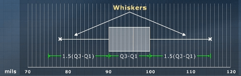
Box Plots
Box Plots: The first item that is drawn in a box plot is the median of the data. The median of the data is where 50 percent of the observations lie below a particular number called the median and 50 percent lie above. It is also known at the 50th percentile of the data. The first quartile is represented as the number which has 25 percent of the observations falling below it. The third quartile, similar to the first quartile, is not where 25 percent of the data lie below, but it’s where 25 percent of the observations lie above. In boxplot there are observations called whiskers. The whiskers can potentially be 1.5 times the width of the box away from each quartile. Few items can be identified on a boxplot called outliers. Outliers are any observations in the data that actually fall outside of the potential whisker lengths.
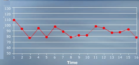
Time Series Plot
Time Series Plot: The basic chart that plots a performance characteristic over time is called the time series plot. In a time series plot, the X-axis is time. The Y-axis is then the performance characteristic of interest. Time series plot becomes a running record of a process characteristic over time. A time series plot also gives a sense of whether or not this performance characteristic is in statistical control.
Control Charts
Control Charts: A control chart, just like a time series plot, has time on the X-axis and the performance characteristic on the Y-axis, but it also adds a line that represents the average of observations. For an individual control chart, this line is called an X-bar line. It represents the average or the mean of all observations. Control charts also add what are known as control limits. Control limits are drawn at three sigma limits from the mean.

Scatter Plots
Scatter Plots: The graphical tool used to analyze a continuous output variable versus a continuous input variable is called a scatter plot. A scatter plot allows you to take an X such any input and relate it to a Y such any output. Each X has a related or an associated Y that goes along with it. So in this manner, we can plot all of XY data on one graph and can see if there is any positive or negative or even curvilinear trends in the relationship between this particular X and Y.

Related Page:
Check out our Statistical Process Control (SPC) Training, Basic Statistics Training, Six Sigma Training, Lean Six Sigma Training, Lean Training, Continuous Improvement Training or the full range of Training Courses for relevant courses on Control Charts, Statistics and how to streamline & improve your business processes.