Control Chart
Control charts are utilized to study process changes. Data is plotted in sequential order in control charts. Control chart have a central line that is used to show average, an upper control limit and a lower control limit line which are calculated from data. We can draw conclusions by studying data against these lines and show process variation consistency or inconsistency meaning-by out of control.
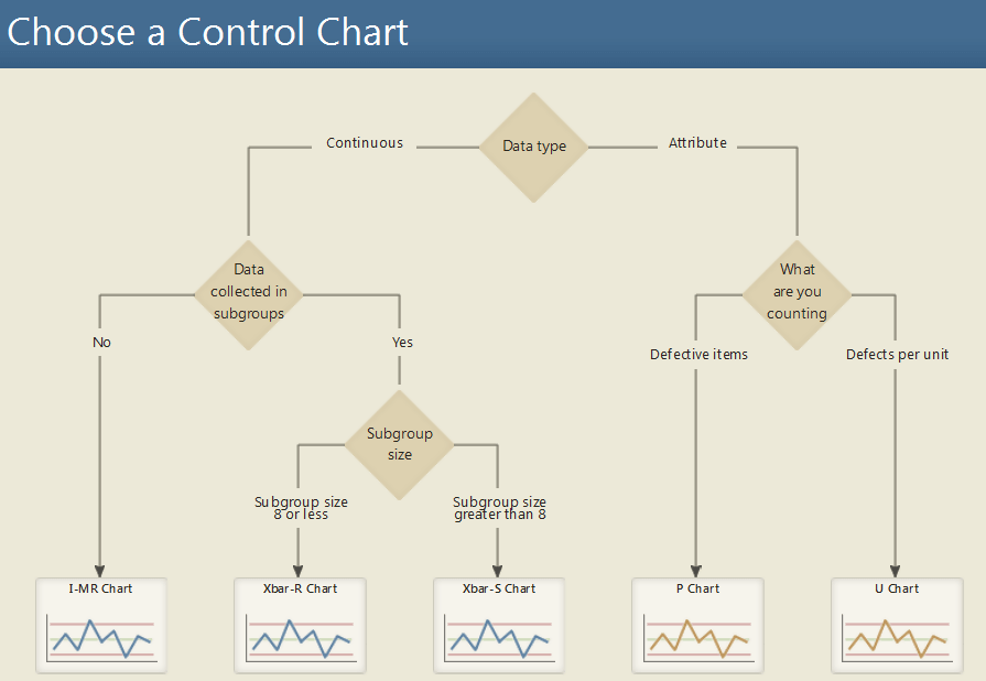
An important thing to note that Control charts for variable data are constructed in pairs. For example, a top chart shows the average, or the centre of the data distribution for a process whereas the bottom chart shows the range, or the width of the distribution. Control charts for attribute data are using single charts. Following are the selection criteria for Control charts.
(Source: Minitab18®)
We will discuss the following control charts and their qualities:
| Control Charts for Variable Data | Control Charts for Attribute Data |
| Xbar-R chart | P Chart |
| Xbar – S Charts | NP Chart |
| I-MR Charts | U Chart |
| C Chart |
Control Charts for Variable Data
X bar R chart
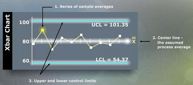
The control charts for continuous data with subgroups can be made using Xbar-R charts. Each of these plots statistics that are calculated from small samples in the process taken to represent snapshots, that is, data gathered over short periods of time, of process performance. From these snapshot samples, estimates of process “location” and “spread” are calculated, specifically the Xbar-Range. The Xbar chart is a time series plot of the Xbars evaluating the consistency of process location through time, and the range chart does the same for process variation. The main components of an Xbar chart are:
- A series of sample averages to be plotted sequentially to look for non-random patterns.
- A center line that represents the assumed process average, often, this is the grand average, the average of the averages, called X double bar.
- Upper and Lower Control Limits.
The control limits use information found in the R chart data, specifically, the average Range or Rbar.
They represent the expected variability in the Xbars if only “common cause’ variation exists.
The Range chart is a plot of the ranges of these process samples, plotted on the same timescale as the Xbar chart. The main components of a Range chart are similar to the Xbar chart:
- A series of sample ranges to be plotted sequentially to look for non-random patterns.
- A center line that represents the assumed process range. Often, the average of all the sample ranges, called Rbar, is used.
- Finally, the upper and lower control limits.
These control limits, too, are calculated from the value of Rbar.

One of the reasons that control charts are so popular is that even though they are a very powerful tool for identifying variation, they are constructed using simple arithmetic.
Xbar charts are one of the most widely used charts. Besides simplicity of construction Xbar charts are popular for another reason: A statistical principle called the Central Limit Theorem states that averages tend to be normally distributed, even if the individuals are not. In other words, even if your process is not distributed according to a normal distribution, averages of that process will tend to be normally distributed. This is a good thing, since all of the probabilities associated with control limits and their interpretation are based on the normal distribution. Finally, the point of a control chart is to compare between group variability to within group variability. Or in capability terms, comparing long term to short term. Xbar-R chart data is perfect data for performing capability calculations.
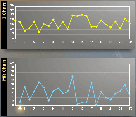
I-MR Chart
This control chart plots the individual data points and moving ranges. Individual chart is plotted on each value and for the moving range chart, the differences between successive observations is calculated and plotted. The moving range chart starts one observation past the individuals chart because our moving range starts with the second observation minus the first observation. After each data point for the individual measurement is plotted, the moving ranges are plotted underneath them.
Since there are no subgroups, we cannot calculate directly short-term or within-group variability. In the case of an I-MR chart, the within-group variability is estimated by looking at the differences between successive observations, and it is called a moving range. Below is a sample of I-MR Chart.
About data gathering one should try to establish the frequency of the data collection to provide the control necessary based on the history of the process. Too much data causes too much work and resistance to implementation. With too little data, significant process variations may be missed or discovered too late.
X bar S Chart
This chart is rarely used in a manual calculation environment since standard deviation calculations are more complex than simple ranges. An organization should use an Xbar-S chart, if they have computer software system that can do it automatically. The results of the Xbar-S chart are almost exactly the same as those for an Xbar-R chart.
Control Charts for Attribute Data
Chart for Defectives:
P Chart
In P chart, the opportunity does not have to be constant for each subgroup size, but when we do calculate the limits, we will use the average subgroup size in the calculations. NP charts are the same as P charts except the subgroup sizes are constant. With constant subgroup sizes, proportions are not used and the actual counts of the defective units are used.
NP Chart
In NP charts each subgroup, the number of non-conforming units and the number of units sampled are recorded.
Chart for Defects:
U Chart
The U chart is for count data divided by the opportunity – in other words, defect rate data. These control limits too are based on the Poisson distribution and are also very easy to calculate. They are simply the average defect rate +/- 3 square roots of the average defect rate divided by the average count
C Chart
The control limits are just the mean count, that is, Cbar – the average count, +/- 3 times square root of that average count. One common application of C charts is to track accident rates, or in this case, near misses. The chart is used to track month to month data to determine if safety programs are effective. The opportunity or exposure in this case, is one month, and is considered constant for this application.
Related Page:
Check out our Statistical Process Control (SPC) Training, Basic Statistics Training, Six Sigma Training, Lean Six Sigma Training, Lean Training, Continuous Improvement Training or the full range of Training Courses for relevant courses on Control Charts, Statistics and how to streamline & improve your business processes.